


Be World Class was founded to coach individuals, teams and organisations to maximise their performance, and work towards becoming world class in their field.
We undertook a strategic rebrand to realign the external and internal worlds of Be World Class to visually communicate the quality of work and results they deliver.
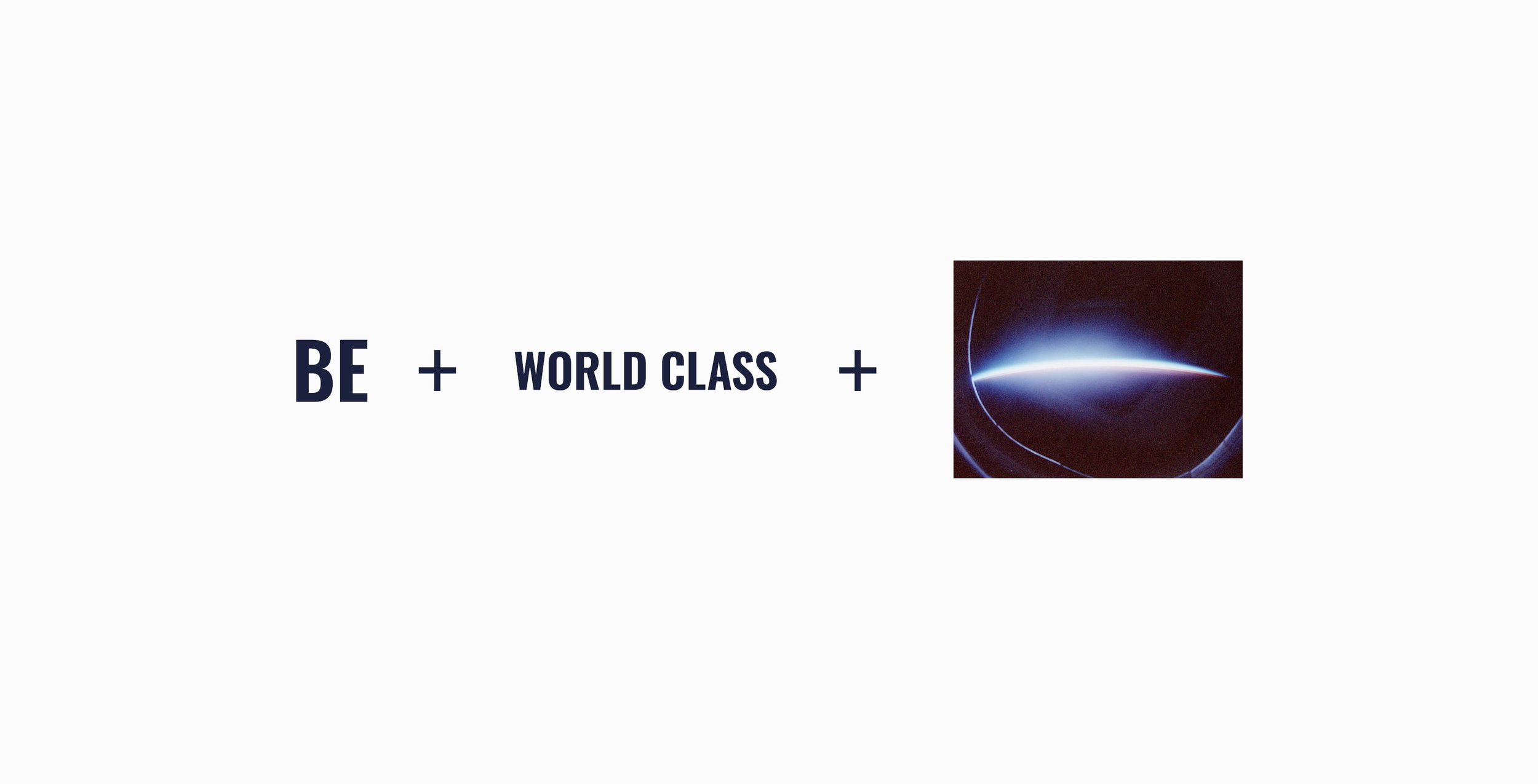
The results-orientated nature of the brand is emphasised by the difference in scale between the word ‘Be’ and the words ‘World Class.’ This isn’t about planning to be, hoping to be or wanting to be; this is about being world-class.
The underscore was inspired by an Earth limb as seen from space to represent the scale of the brands and clients’ ambitions. Photo: STS-46 Earth observation taken from a flight deck window aboard Atlantis, Orbiter Vehicle (OV) 104.
As a company, they wanted to maintain their horizontal niche, so the resulting identity needed to appeal to the elite sports, entrepreneurial and corporate worlds.
However, a key part of their philosophy is to preach what they practice, so they are also a media company. The font selection was critical in ensuring they were correctly positioned to take account of all of these things.
Oswald was chosen for it's commanding stature to convey confidence and authority. This together with it's narrower letterforms makes it ideal for applications like mobile web design and social media where maximising impact within limited space is crucial.
Oswald was paired with Overpass for contrast and clarity and also the upward pointing angles on the ascending strokes, suggestive of upward trends and increasing improvement. As it is also an interpretation of the well-known 'Highway Gothic' it also added a more global sense of place.
Finally the Roboto superfamily was used for sub-headings and body copy for its natural reading rhythm to add some warmth.
At the time of briefing, the Be World Class website had grown over 16 years. True to their ethos, one of the first things we undertook was a simplified restructuring of the information available to really make sure the incredible results they were getting for clients took a more prominent position. The brand identity was developed across the site and was further enhanced by Steffi Andrews and Joel Lowson's imagery.
We redesigned all the Be World Class cover imagery for social media together with a set of multichannel templates. These were all provided in Canva.
In addition to all the design collateral, we provided a full set of Brand Guidelines and also a twenty-seven page Brand Foundation document which summarised the Brand Strategy work we had undertaken and which included things like their Purpose, Mission and Vision statements, Brand Personality, Positioning, Target Audience and Competitor Research, Ideal Client work and the insights and actionable suggestions which had arisen from this.
To see the finished website please visit: https://be-world-class.com/