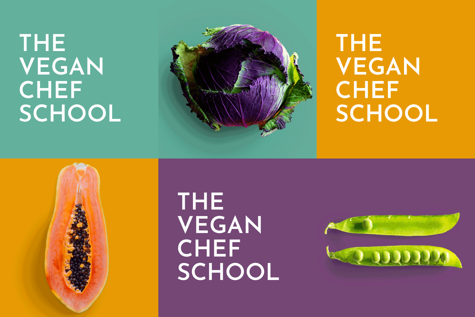


Wordmark and imagery for The Vegan Chef School. The school was founded by Pro Vegan Chef Day Radley with a radically progressive mission - to move forward veganism, sustainability and compassionate ways of being through communication, learning, research and development. A core component of this mission is their twelve week Fast Track Vegan Chef course.

As a Director Chef Day already had entrepreneurial experience and so was familiar with self-publishing applications like Canva, Google Docs and Squarespace. She wanted an identity and publicity material that she could run with herself and which could be easily shared within her team. For this reason, to ensure compatibility between team members and across applications the designer decided to work with Google Fonts. Josefin Sans by Santiago Orozco was selected for their wordmark for its simplicity and elegance.

Josefin Sans has terrific range with five weights and their italic variants; giving a broad typographic palette which would serve TVCS well into the future. The two principle weights employed are light and semi-bold which give great contrast to each other and to the photographic imagery selected.

Chef Day had already taken several beautiful shots of singular vegetables (of which this is one) which showed each ingredient through the eyes of a pro vegan chef. The designer felt this point of view was invaluable given that the target audience of their Fast Track Vegan Chef course would be aspiring vegan chef’s. Their simplicity also fit perfectly with the brief and the manner with which they highlighted each ingredients value and potential also spoke perfectly to the School’s wider aims.

Additional imagery of fruit and vegetables shot in a similar style to Chef Day’s was sought. All were given a consistent treatment in Photoshop which would allow Chef Day and her team to interchange foreground imagery and background colours. The principle brand colour (shown here) which was chosen for it’s modern appeal and also because it was a less obvious choice than say a more earthy green which was in-keeping with the School’s forward thinking approach.

Additional colours within the palette were inspired by the beautiful colours of the raw ingredients themselves.

Care was taken with the selection of lighter colours like this papaya yellow which had to be rich enough so their namestyle and any accompanying text was still legible.

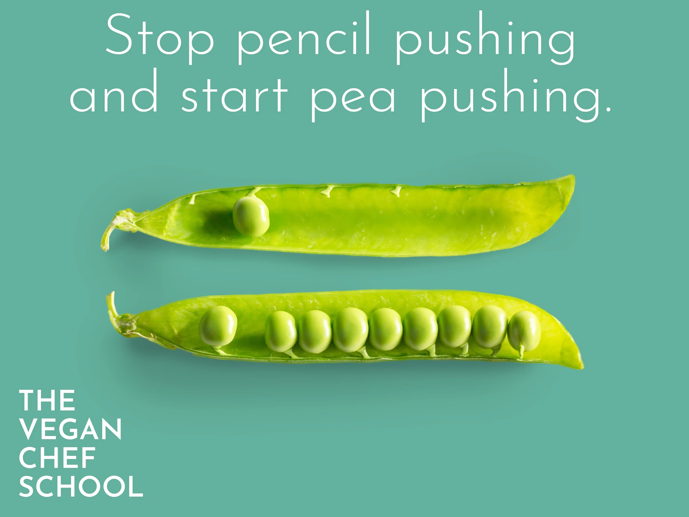
Standing out on social media is tough. Colour, type and movement can be incredibly useful. Animated GIF’s were used as pattern interrupts to this effect. This GIF was created by the designer to demonstrate their potential. As an already capable user of Photoshop Chef Day was able to run with this idea to great effect.

The terrific appeal of the Fast Track Vegan Chef course was that it would allow students to quickly pursue their passion for v-cuisine within their working life. Between us we came up with quirky phrases which played with what this would mean.

A range of phrases and accompanying imagery were developed for launch with each design being made for their two main social media channels; Instagram and Facebook.

Some of which are shown here… Layered Photoshop files and master files of the namestyle suitable for print and screen were handed over to the client.